Toni & Guy has a strong history, starting from humble beginnings in England in 1963 when two teenage immigrants, Giuseppe ( Toni) and Gaetano (Guy) Mascolo opened their first hairdressing salon in South London. Fast forward half a century and Toni & Guy has established more than 400 salons across the USA Europe, and Australia. The brand entered Australia in 1995, opening its first salon in Sydney’s Darlinghurst, and today has 35 salons across the country. This year it has begun the pr
ocess of revamping some Victorian outlets, starting with Port Melbourne, which boasts a design that won first place in the 2014 Australian Interior Design Awards.
The new look for Toni & Guy has since been rolled out to two other Victorian stores, on Church St, Brighton; and Little Collins St, Georges, in the Melbourne CBD.
Travis Walton of Travis Walton Architecture & Interior Design, was tasked with creating the new direction for the iconic hairdresser.
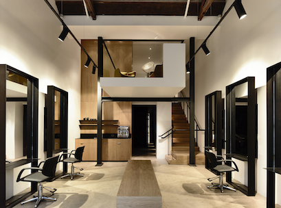
A decision was made to move the Port Melbourne salon from its original 220sqm Bay St site, to a smaller, 80sqm location in a heritage building across the street.
Walton’s brief was to create a successful relocation for the brand that would make it more efficient in a smaller space.
In response, Walton came up with the idea of a mezzanine level. With the introduction of the mezzanine, he produced an exclusive VIP area with private colouring station and separate hair washroom below.
“From a design perspective we were looking at a new direction that was a bit more fresh, and responsive to the clientele of the area.
“Being an upmarket Melbourne area, we responded with soft minimalism, which worked really well in the heritage building,” said Walton.
Staying true to the new site’s heritage, Walton and his team chose a palette of black steel and American Oak.
“The black steel allowed us to have a very industrial aesthetic, but it’s also very light, so you see a lot of the metalwork creating frames with voids through it – it gives that sense of openness,” he said.
The thin edge of the metal appears sharp and works to incorporate the structural elements of a cutting station.
The walls are constructed of floor to ceiling American Oak panelling.
“It’s such a striking element to go from floor to ceiling with the ceiling being double height. We did it to give it a bit of softness and pull back from the hard edge of the metal, so we’re just playing with the balance between those materials.
“On the floor, we used the existing concrete slab and polished it up, so we got quite an industrial feel, a bit more of a warehouse sort of aesthetic, which really seemed to sing to the brand,” he said.
“We took ideas from the traditional salon experience, where each process would take place in a separate area.”
The cutting floor, colour salon, and washroom are now completely separate.
“The washroom area is a very dark space. The only lighting is a very small pin light that shines on the customer’s head to create relaxation and a therapeutic experience.
“Rather than being on the main cutting station floor, you’re actually in a private area and there’s a focus on relaxing,” he said.
In the mezzanine area, Walton retained the existing heritage roof trusses to contrast with the sleek new fitout below.
Prior to designing the new look, Walton did an initial analysis of Toni & Guy’s strengths and weaknesses, looking at the salon
experience, how to streamline its processes, and heighten the overall experience for the customer.
“There’s the sensory experience, but there’s also the retail side in terms of product and customer service. For instance in Port Melbourne, the sales counter has almost disappeared, it’s just a small counter at the entry, it’s very open.
“We’ve looked at breaking down those traditional barriers of public and private, making the customer experience a little bit more friendly and accessible.
“That has opened up a few things, such as being more one on one and personable with your salon attendant, but it also means there is more service potentially at the cutting station.”
Elements such as moveable retail displays, and wireless payment and transactions have been been layered in.
“Integration of technology and audio visual signs at the salons to display looks, and promotional videos, live streaming, and fashion shows has been introduced, so we’re trying to integrate a lot more of that multi-media component into the salon experience.”
To date, three Toni & Guy salons in Victoria have been revamped by Walton, with each fitout slightly tweaked to suit the local area.
“We’re trying to be quite responsive to where the salons are, rather than have a preconceived design response. There’s similarities in terms of detailing, the sharp clean edge, and things like that, but the material palette changes a little bit,” he said.
The Brighton store uses parquetry flooring and white metal rather than the exposed concrete and dark metal of Port Melbourne, to fit the beachside culture of the area.
“The new direction is really sharp and modern, and I think it suits them well.”
This article first appeared in Inside Retail Magazine. To subscribe, click here.