The following schematic indicates the percentage of sales that is typically created in each area of the standard specialty store. The design of a store has the single objective of maximising sales. In order to achieve that objective, a well designed store will meet a number of criteria: Functional and practical Aesthetically pleasing décor which improves morale of staff Meets the needs/requirements/expectations of the target market Cost effective Complements the merchandise Supports the
e store’s strategic direction, positioning, and brand
Minimises shrinkage and opportunities for theft
Avoids ‘sameness syndrome’ by retaining a unique image.
Exteriors
Store design begins before the customer enters the store. What the store looks like before the customer enters it is crucial to the performance of the store.
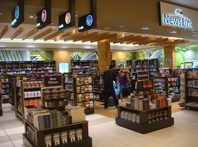
The image to the right is of a newsagent in far north Queensland.
Note the following:
Flexible fixtures
Clear, simple sign/ name/logo
Ceiling treatments that draw the eye in
Ability to see through the store right to the back
Lack of clutter = good landing zone for customers
Legible, simple signage (e.g. ‘new fiction’) and it is the right type of merchandise for this particular zone
Graphic treatments of back wall draws the eye in
Rhythm and harmony in the merchandise (stacks of books) to make a strong statement.
Textures and floor covering
Effective (bright) lighting without creating a ‘warehouse’ look
Graduating heights: low in the front of the store to high at the back.
Landing zone
The landing zone (or ‘decompression zone’) is the area immediately inside the entrance of the store. Its size may vary from several square meters in department stores, to something much smaller (almost non-existent) for some specialty stores.
Window displays must have sufficient wow factor to stop passersby in their tracks. Once you have grabbed their attention and they decide to enter the store, they must undergo a physical and psychological transformation. (Watch carefully and you will see how they slow down, fold away the umbrella, pat their pockets, settle the child, adapt to the lighting etc.)
It feels counter intuitive to leave some of your (potentially) productive space empty, but one should view it as an investment in space required for customers to mentally and psychologically transition from passerby to browser. This transition is necessary in most stores before you can convert browsers into buyers.
If you are going to break the landing zone rule, then break it properly (wow like a window display) in order to (figuratively speaking) punch the customer between the eyes. If you are going to do this, then do it infrequently in order to retain the surprise element.
Gold zone
This is the primary retailing zone, the most productive space, so must managed accordingly. (Front third of the store.)
Types of products to display:
Core merchandise (signature lines, higher margins)
Introduction of new lines
Major promotions
Price leader
Brand leader
Best practice merchandising:
Change weekly – even daily.
Wow creative impact
Strong signage
A special plea to indie retailers: This is not where you put your counter. Please refer to the first diagram again and think about how much that piece of real estate ‘owes’ you and whether your counter actually generates any sales.
Silver zone
This is the secondary retailing zone that must managed accordingly.
Types of products to display:
Secondary merchandise (A and B lines)
Support stock introduction of new lines
Best practice merchandising:
Clear sight lines from front of store
Change fortnightly/monthly
Bronze zone
This is the tertiary retailing zone – the least productive space that must managed accordingly.
Types of products to display:
Bulk of stock
Staples
Lower margin
Comparison
Best practice merchandising:
Change quarterly (refresh)
Priority is housekeeping and ease of shopping (not wow!)
Dennis