Inside Shopper reader, Rebecca M, recently emailed me after having read my February article on Target West Lakes. Rebecca waxed rhapsodic over her local Target at Frankston on the Mornington Peninsula in Victoria, so I had a poke around it last week, and then the Kmart in the same Bayside shopping centre for comparison. It was like night and day. Below is a summary of what I found, but as usual, the pictures tell the real story. If range and price are the basics and the cost of entry in mass mer
chants, then here I will focus on customer experience, particularly the environment, entertainment, and to a lesser extent, simplicity elements of Dr AK Pradeep’s seven shopping experience dimensions.
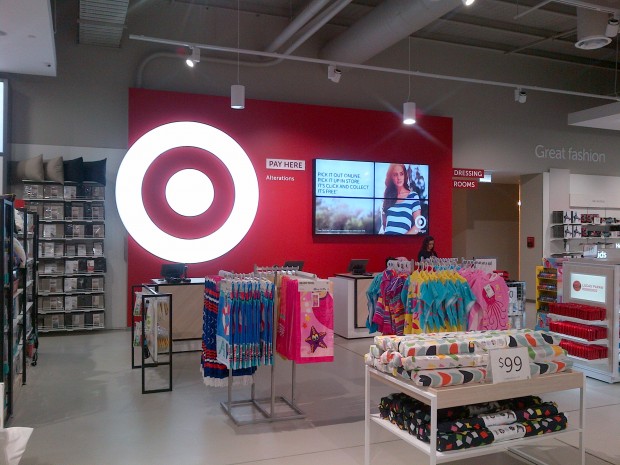
TARGET IS LIGHT, WELCOMING, ALMOST PREMIUM WITH VALUE ADDED ELEMENTS
Impactful entry
The first thing you notice at store entry is the huge digital screen wall to the right displaying Missoni fashion, which had launched the day before. This is a step on from the freestanding entry digital sign at Target West Lakes.
To the left is a café with glamorous Hollywood style lighting to attract attention. The café ranges lesser known beverage brands and has a basic range of foodstuffs. At the time of my visit at 2pm on a Wednesday, it was full of mums with prams.
Premium Feel
The store is lit with LED downlights rather than fluoro and is very light and bright (and again, slightly more glamorous).
Some of the fixturisation, as in the lingerie area has a feel specific to that department. Confectionery has gone both fun and upmarket versus other mass merchants, with chocolate gift boxes lining the walls and local producer, Happy Lab, providing a more old fashioned lolly shop feel.
Myer and David Jones could learn from the changerooms here. Not only do they include seating areas, extra wide changeroom doors and premium light fixtures, but the lighting inside the changerooms themselves is soft and flattering. Finally!
Ease of navigation
Stock and signage is all low profile so you can see right across the store from the entrance. From the entry, five pathways radiate out across the store, the main one being the open runway through the middle of the store to the back wall, which has even fewer displays in it than West Lakes did, maintaining the open feel.
At the time of my visit the focus was on a series of jeans tables with low pricepoints to communicate value. Department navigation and signage has moved on from the blue His, pink Hers, turquoise Baby, and beige Home of West Lakes to the brightly lit Hollywood style signs, which are freestanding rather than being against the back walls, and feature lightboxes with product images, such as men’s shorts, for more subtle subcategory navigation.
Fixturisation has been thought through, with major display boxes against walls (‘wardrobes’ in Target parlance), for ambience and navigation and some with price pointed product to communicate value.
Value added services
A number of services have been added to this store. A garment alterations service is communicated in the changerooms, the sales point outside of the changerooms, and the services desk.
In the changerooms, you can use a ‘Changeroom Help’ call button service to have a Target staff member fetch you a different size or colour so you don’t have to re-dress and go running through the store to find it. This isn’t a revolutionary service, specialty fashion chains and the department stores theoretically do it, but it’s a level of service unusual for a mass merchant.
Custom t-shirt printing
Custom T-shirt printing is available in the camera and photo section for $15+ per item (including the shirt), and store staff member Jemma tells me this is proving popular with local sports teams, although the capability of the service is as much for one off prints as for group designs. Shoppers can bring in their image in a variety of file types, on a USB stick or even on their smartphone and it is reproduced on a Target Essentials T-shirt. It will be interesting to see the level of take up of this service, as you pretty much have to be in the photo and entertainment section of the store to notice it.
Elements of discovery
There are some elements of the store where it appears the strategy is one of discovery, as they have either little or no signage:
Interactive floor projection for kids with multiple games including a piano keyboard you can jump on to make tunes, like in the movie Big with Tom Hanks
Interactive screen games, tablet style like a Microsoft Surface tablet and with a bench seat, are housed in an open cubby house underneath the Toys department sign
Online kiosks have the same signage as Price Check and confused me a bit. Perhaps the wording should be something like ‘order online’ and then separately ‘price check’ to differentiate the two services. At any rate, these kiosks have the capacity for you to order online while in the store – helpful for bulky items such as large toys, or if your desired garment size or colour isn’t in stock. There were several of them in the store, although at time of visit they were down. Again not a revolutionary service, something that UK retailers such as John Lewis and New Look have been doing for several years, but a first for an Australian mass merchant
‘Assisted ordering online’ at the back of the store at the click and collect desk was available as a computer screen, although its use wasn’t immediately clear because it wasn’t signed.
According to Rebecca M, “I definitely believe these little extras for kids attract families. The beauty of having child friendly and interactive areas was that the kids weren’t driving me crazy with their usual whingeing and wanting to leave. But on the flipside they really ‘didn’t want to leave’, which gave me ample time to notice a lot more merchandise than I normally would. My boy has a very active imagination, and even without the displays, the shopping experience was entertaining enough for him because he had a kiddie trolley to push.”
Perhaps some of these discovery elements could be called out more overtly if they are destinations for mums with kids.
KMART IS DARK, CRAMPED AND FEELS DOWN MARKET
To be fair, they were reshelving for Christmas, with decorations and trees etc, but this doesn’t excuse unboxed stock elsewhere in the store and papered over signage.
I can’t see where I’m going
This newer style Kmart features high departmental navigation signage which, however bright the colours used, ultimately has the opposite effect of what was intended. Right from the front entrance these high signs block visibility and interrupt sightlines.
I think I get what they are aiming for – ‘zones’ – but three sides of department signage per department creates walls and serves to make a zone feel boxed in and cramped, despite the colour.
In addition to the average visibility, pay points are a bit confusing – one central one in the middle of the store, and then a series of self checkouts upfront to one side, which felt like a bit of an afterthought.
Fixturing and ambience
Store lighting is dark, with basic fluoros running in lines along the ceiling contributing a factory-like feel, but not in an industrial chic way.
Fixturing is not consistent – Home vs others fixtures that have the bold colour stripes. Signage is amateurish – pricepoint bomb hanging signs papered over, but with no pricepoint; subcategory signage looked stuck on with Blu-Tak and likely to fall off. These looked like afterthoughts and not part of the fixture.
Interactivity and value adds in this store were non-existent and basically consisted of a few price check points scattered throughout the store.
Overall
To paraphrase Dragnet, ‘just the basics ma’am, just the basics’. The overall effect is down market, bordering on dingy. I was a bit surprised, as other Kmart stores (even the older formats) were better than this one. Simple improvements to lighting and lower fixtures would help.
IN SUM
The Target store was excellent and over delivers for a mass merchant/discount department store. It was welcoming, bright, friendly, easy to navigate, had sleek fixtures and signage, and felt more premium.
Kmart felt dark, cramped, and down market due to unboxed product everywhere and amateurish signage finishes. It will be interesting to see where Kmart takes its store design next and whether it will follow Target’s value added path or remain basic.
*Disclaimer: Author’s experience not necessarily representative of all stores in the chain as is based on that store on that day.
Norrelle Goldring is head of shopper insight and retail strategy at global research and retail datahouse, GfK. Call Norrelle on 0437 335 686 or email norrelle.goldring@gfk.com.
Target
Target lingerie
Target changerooms
Target meswear
Kmart signage
Kmart home